Hiya Botanicals
ldentity, packaging
Hiya embraces the rich heritage of indigenous Filipino healing and wellness practices, presenting them in a modern, accessible way. The brand focuses on promoting overall well-being through products that are inspired by traditional remedies and natural ingredients sourced from the Philippines. Each product is designed to honor and preserve the knowledge of Filipino healers and their connection to nature.
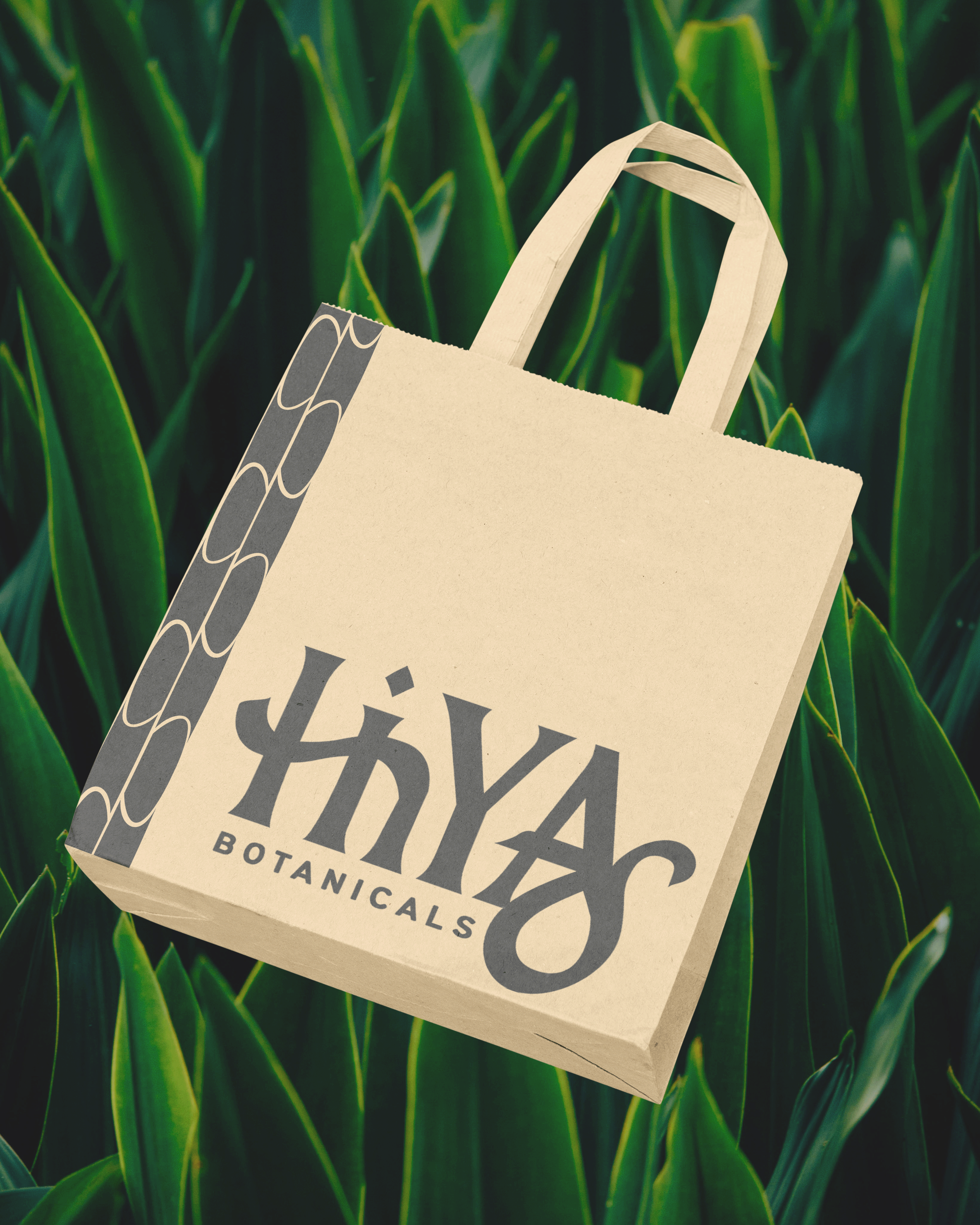
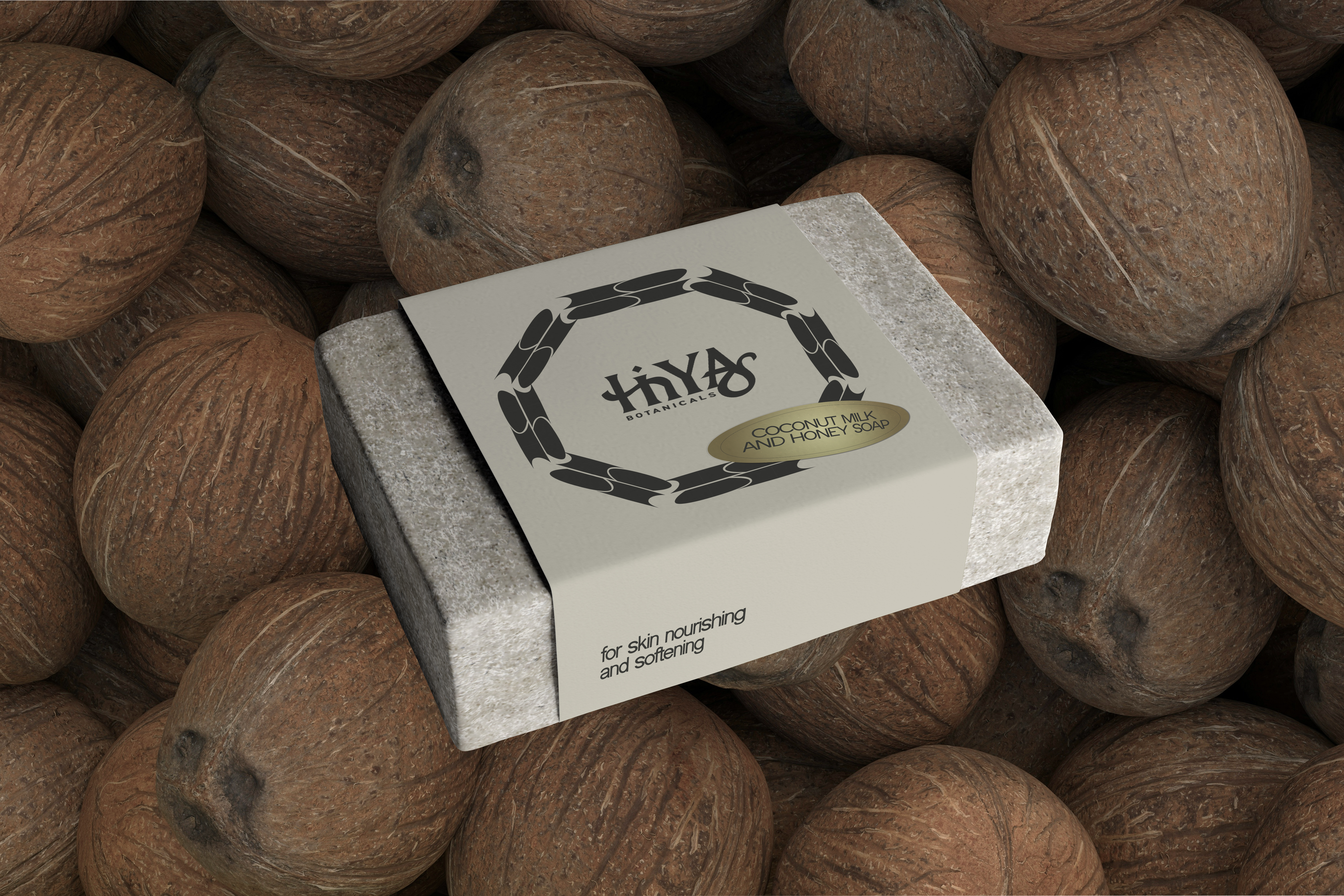
The brand takes its name from the makahiya plant (touch-me-not) which is known to fold its leaves when touched. The name references the dynamic capabilities of the local plants which is also reflected on the pattern seen on the packaging.
The logo references baybayin, a pre-colonial script used in the 16th and 17th century in the northern locale of the archipelago. I incorporated the baybayin characters of the brand name into the main logo.
Overall, Hiya highlights the deep connection between Filipino culture and natural healing practices. The brand ensures authenticity by collaborating with local Filipino communities and healers to source ingredients ethically and sustainably, while providing clear, approachable information about each product's benefits and origins.